![]()
![]()
 |
Introducing Magpie by Vincent Connare.
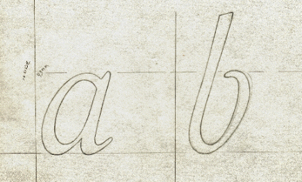
The creation of two Magpies¶ One is for sorrow, two is for joy, this is a well-known English saying. Even numbers of these beautiful and common European birds are good luck. If seen on your way to the racetrack or anywhere else for that matter you are blessed with good luck. The birds travel in groups during the spring and winter but are often singular during the autumn and summer months. Their feathers are overall black and white, but are highlighted with a little cobalt blue, green and purple on their back tail, which are the longest tails of their species. ¶ When I designed a font that I could name after this creature its original inspiration is not solely from the bird but for the reasons that I believe the most difficult typefaces to design are book typefaces. I began the design process by looking at the 18th century designs of Simon-Pierre Fournier le jeune. I was in search for a typeface that would be transitional in classification and contemporary in design. My first attempts were lifeless and had stereotypical type features; generic bracketed serifs, straight stems, digitally geometric curves, and lacked the spirit of an original design. Initially I was adamant to design with the computer. My rational was the digital device is the modern tool. Then I thought it would not be correct or modern to design in another medium when the final medium is digital. During the design process I was inspired by Michael Harvey’s workshops and his practical hands-on letter cutting. I carried on from his workshops an experiment of cutting letter shapes into hard wood. This woodcutting mimics the method of cutting steel punches. ¶ My first break through was when I began on the italic font. I wanted it to be cursive and very different from the roman font. Fournier le jeune’s Bâtarde Italienne and his other Bâtarde cursive styles were very lively and they served as my inspiration for the italic. I was pleased with the results and after showing Gerard Unger my attempt he suggested a method he once discussed with Matthew Carter - that if you are more pleased with the italic an experiment that could help put life into the Roman font is to tilt the italic upright. I rotated the italic sixteen degrees counter-clockwise and then used that as a base for a new Roman font. This brought a calligraphic quality into the typeface derived from the cursive nature of the italic. The italic features such as the single story letters were removed and the result is Magpie.
|
|
| Original Drawings of Magpie italic. |
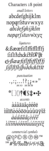
Characters in Magpie were chosen from typefaces created for publishing of the 16th century up till the 21st century. The emphasis is on characters that have been in typefaces created for Christian publishing of the 16th century in England, France and the Italy. Additional characters support the 19th and 20th century French, English, Italian and Spanish language traditions and their publishing history. The Versicle and Response characters are used in Christian prayer books and present in typefaces used for Vatican publication since the 16th century, the typefaces used by Oxford University Press to publish religious books and the types of Simon-Pierre Fournier le jeune. Other characters present are from 19th and 20th century commercial printing. The per character is a partner to the at cost and present in types in Europe and America and used with other characters to create commercial bills of sale and bookkeeping material.
Magpie was designed as a book typeface and also planned as an OpenType font that focuses on the latest electronic book technology. Magpie’s future technical font production will include OpenType support and specific hinting for electronic books and Microsoft’s ClearType. The examples below show a screen shot of Magpie being displayed on a Hewlett-Packard Jornada 540 PocketPC with the Microsoft Reader and ClearType (Magpie as shown here is unhinted). The text is from an unpublished essay by Vincent Connare titled ‘The type designs of William Addison Dwiggins’.
Microsoft also offers a ClearType Reader for Windows. Below is a link to view an image of Magpie (unhinted) using ClearType in the Microsoft Reader for Windows.
Magpie and Magpie Italic, large sample, 33k. Click here
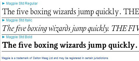
Magpie is a contemporary look at the history of typography with a warm and cursive flow that is
reminiscent of hand crafted typography. It is appropriate for traditional text and small text notes in book settings. Magpie was designed in 1999-2000 by Vincent Connare as part of the type design masters program at the University of Reading in Berkshire, England.
A great deal of thanks is due to Dr. Christopher Burke and Gerry Leonidas, Professor Gerard Unger and Tiffany Wardle for thier support and design expertese, to Professor Paul Luna for his expertese in book publishing and his keen eye for good typography, Alejandro lo Selso for his type design and language feedback and Michael Harvey for his inspirational lettercarving. To download the Magpie booklet created from the University of Reading and presented at the AtypI 2000 congress ...Click here...! Get Magpie (Standard set) NOW from Dalton Maag Ltd London.
Magpie is a trademark of Dalton Maag Ltd. All text on this page is copyright 2000 by Vincent Connare. All rights reserved.
|